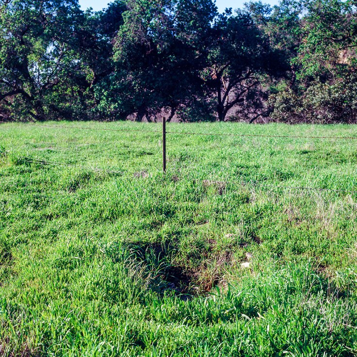
Untitled (Trabuco Flats) 2019 copyright Douglas Stockdale
Color Management is one of the current plagues for photography as it effects anyone who is using a monitor to evaluate photographs, whether color images or black & white images. This includes cell phones as well; any type of monitor. Whether a casual social media reader, a photographic collector or a a photographer and most vexing for the later two.
So speaking as a photographer, I try to maintain an internal color management system that attempts to ensure that the photographs I create are faithful the images I print and of course the ones I share on-line, whether social media, web-site or on this site.
What I just learned is that when I recently purchased a new 27″ iMac, I had assumed that the monitor was already calibrated. In retrospect; bad, bad, bad.
When I just published a photobook review on The PhotoBook Journal, one of the comments back from the photographer was to the effect that my images on his screen appeared “blown-out”. hmmmmm. Not so much on mine. BUT I knew that he was a working professional photographer and thus he may have had his color management in a more current state than I did. Also, I recalled my iMac monitor calibration assumption. Not so smart.
I also knew it was time to update my color managment system, thus I quickly acquired an X-Rite i1 Studio system (aka Photo-Munki) to calibrate my monitor, printer and camera. Once the on-line registration was completed the required system software to download was provided on my online X-Rite profile. Done. Then it was a matter to run the software with the sensor (a bit hard to rotated the indicator dial on my device) and finish with a new icc profile for the monitor. Yep! A little different look to the iMac monitor. sigh.
Better late than never.
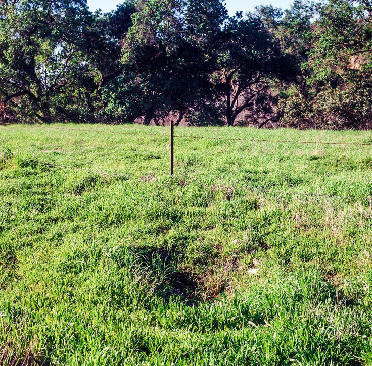
Interestingly, not all of my prior post photographs appear that different, but the most recent one did; see below the version that I had posted. I am not linking the earlier post as I have already updated that photograph; no sense letting this version of the image continue to haunt me. Probably most noticeable aspect to me between the two image versions are the greens. I also notice that other earlier images have the reds going bonkers (oaky, a bit “blown-out”) in comparision. What about you, what do you see as differences?
The other aspect is that this is a film photograph is from one of my rolls of expired 120 film (I think that this roll expired in 1998), that was processed and scanned by my professional film lab. So a few more potential “color management” events before I was able to evaluate the file in PhotoShop.
I had planned on making some on-line submissions but now I need to recheck all of the image files for color balance, etc; do these images still look as I had intended? If not one thing, it’s another.
Cheers, Doug

Leave a comment