I am currently in the midst of finalizing my book concept for Instant Nomad, my investigation of travel and anxiety, as I mentioned in my last post about testing photographs in my book-dummy. I have had some ideas of what my book cover might look like, but now realize that it was time to get serious about the actual book cover design. I anticipate a tip-in photograph, so that is one part. The book I envision will be horizontal, so another part is to determine photo size and location of the tip-in. The third part is probably the most vexing for artist and photographers alike, including me; what style and size font for the title text?
For a book-dummy, I understand that I don’t need to get this perfect on the first try, as I am going to send this out to a couple of publishers to see if they are interested. Realistically they might decide on a completely different treatment, nevertheless, I need to share my vision which increases the odds that this might be what is published.
What is vexing for me about topographic elements will delight the graphic artist, who I don’t think dream about fonts, they sure as heck know a ton more about this graphic element than me. I think I know enough to be dangerous, but smart enough to lean on a graphic designer for some help. Lucky for me, I work with a very talented graphic designer, Deborah Davis Design, for my magazine, PhotoBook Journal. Deborah is local here in Southern California, but far enough away across town that we still do all of work virtually.
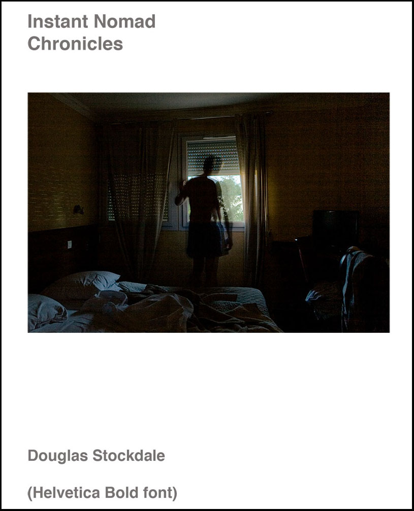
When I sent her my original book cover comp, she had a gazillion questions, but I knew that I wanted a font style that was “sans serif” (Times Roman is maybe the most well know ‘serif’ font), not the fancy type of letters, but more of a block style. And for what I wanted the type of hard cover cover I had in mind, thought it needed to be a bold version. Deborah came back with a ton of ideas and options, including the Helvetica Bold, as well as other subtle variations, such as Din, used in Germany and other countries in the early 1900s and the 50s, and Trade Gothic. This is where a great graphic artist shines; able to translate your intent into something that resonates with your intent and has a ton of experience with all sort of variations. Btw, did I mention that she published a book on typographic fonts?
Each of the various fonts have some very subtle differences and for me requires careful study to be able to differentiate the differences, but I am able to tell what harmonizes with me and which don’t. For those who are not graphic artists, there is a very cool internet resource that you can use to find out what font is used for your favorite book cover, called what else: WhatTheFont. You paste an image of the font you want to identify and Wham!, it’s done. For me, working with a graphic designer has its advantages to help creatively think outside the box.
So I am little closer to finishing the book-dummy as I still have a couple more fonts variations to evaluate, but I like where it’s going. So hopefully I will have more news about a publication date for Instant Nomad in the next few months…
Cheers
Doug
–
Current exhibition:
May 7th – 29th, 2021, Southeast Center for Photography (SEC4P), Greenville, South Carolina. A group photographic exhibition on the theme of Flora, juried by Wendi Schneider. Opening concurrent with Greenville’s First Friday events while there will not be a formal artists reception of this exhibition due to the pandemic.

Leave a comment