First, to be clear, this is not meant to be an exhaustive analysis of the Hahnemuhle Photo Rag Metallic printing paper, but as a user report as to my recent experiences.
Backstory; while attending 2019 PhotoLA earlier this year, I had heard that Mona Kuhn was using a metallic printing for some of her large prints, which intrigued me a bit. I am not a big fan of trick-substrates just to be different or compensate for lame images and I don’t think of Kuhn creating lame images; thus this was something to check out at the exhibition. My take away is that Kuhn was not printing on shiny metal (aluminum) but a metallic paper that was luminous with some texture. The paper did seem to provide for an additional dimensionality of her images; it was difficult to put my finger on the attributes. The combination of image/paper did seem to work for her photographs.
Next I attended a printing workshop at LACP for an evening session and at the end, someone had brought some large sheets (17 x 22″) of Hahnemuhle Photo Rag Metallic (HPR Metallic) printing paper to test a couple of her images on the Canon 2000 printer. The images were somewhat abstract and the results were visually attractive. When she studied a couple of my Memory Pods photos, including the one above, she remarked that that the Metallic paper might work really well with my type of images. And the rest of the workshop quickly agreed. hmmmmmmm.
I had a friend who was printing some of his images directly on Aluminum, perhaps looking for a similar effect, but to my eye, the Aluminum was too reflective and shiny. The HPR Metallic paper had texture and was more of a luster finish than a gloss finish, thus a bit more subtle and closer to my taste in printing papers and resulting images.
The next time I was at ProPhoto I purchased a box (25 sheets) of the HPR Metallic printing paper (8-1/2 x 11″, 340 gms, 100% cotton) to experiment/play with some of my Memory Pods images. I saw this as an opportunity to try something different since my Memory Pods images are meant to be metaphoric and not a straight representational image.
One aspect that I anticipated did play out; the paper being coated with the silver meant that the silver-base that would create my high-light and it is not a true white. Most ink jet printers for fine art do not include a white ink and the ink jet printer depends on the base paper white to create the image “whites” for the highlights. I had recently reviewed a photobook that was printed with many of the images on top of a gold undercoat (Albarran Cabrera – Remembering the Future) and I had noticed that this printing process really dropped the contrast of the images; no “white” representing the highlights in the corresponding images.
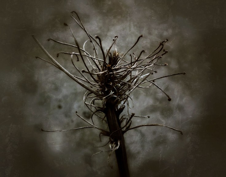
Thus the HPR Metallic was equivalent to using a lower contrast paper versus printing the exact same image on the Hahnemuhle Photo Rag Pearl paper. For most of my Memory Pods images this was fine, but for a few, such as the Angst image above, the HPR Metallic paper seemed to “deaden” the image with the reduced contrast. The fix was pretty easy; in PhotoShop I adjusted the curves adjustment layer by adding a bit more contrast; deepend the darks and raise the highlights as a bit more exaggerated “S” curve. Not a whole lot of adjustment but it did require a little bit of trial and error (even with the paper color profiled for the printer). The resulting image looks amazing. To the point that I sense a bit of three dimensionality when viewing it especially compared to a “straight” version on the Hahnemuhle Photo Rag Pearl. Wow.
Next step was to take a hand-full of the Memory Pods images printed on the H. Metallic to the monthly photographic meeting I frequent to see how these images appeared under the Halogen exhibition lights. As in my studio, the results were visually amazing. What’s more, the other photographers who had previously seen this work before became much more engaged in discussing the images. The others seemed to sense a difference in how this project appeared. At the conclusion of showing the prints I also had a photographer who wanted to make an immediate print trade; a nice validation of the images on this printing paper.
My conclusion is that I need to experiment/play with the HPR Metallic printing paper some more with the Memory Pods photographs. And obtain a box of the 17 x 22″ as the next step to scale the images up.
My next question (trying to recall Kuhn’s framing); when I put this image on the HPR Metallic under glass, will I lose some of the interesting luminosity and three dimensionality? I now have an idea for a framing alternative that precludes the use of glass for the images on this paper. Part of my next series of experimenting/playing!
Featured photograph, above: Angst (Memory Pods) copyright 2014 Douglas Stockdale
___________________
My Artist Talk: Photography Book as Art; PPA August 8th
Exhibition: 2019 Summer Group Show, Fabrik Projects Gallery, Los Angeles, CA, exhibition opening August 10th, 6 – 9pm, 2019
Portfolio Reviewer & Juror for LACP’s first Photo Book Competition, LACP 2019 Exposures Weekend, September 13 – 15th, Marina Del Mar, CA
