This will be a two-for today as I am going to discuss the darker values of an image and introduce our temporary house guest, Shadow. How’s that for a nice Seg-way?
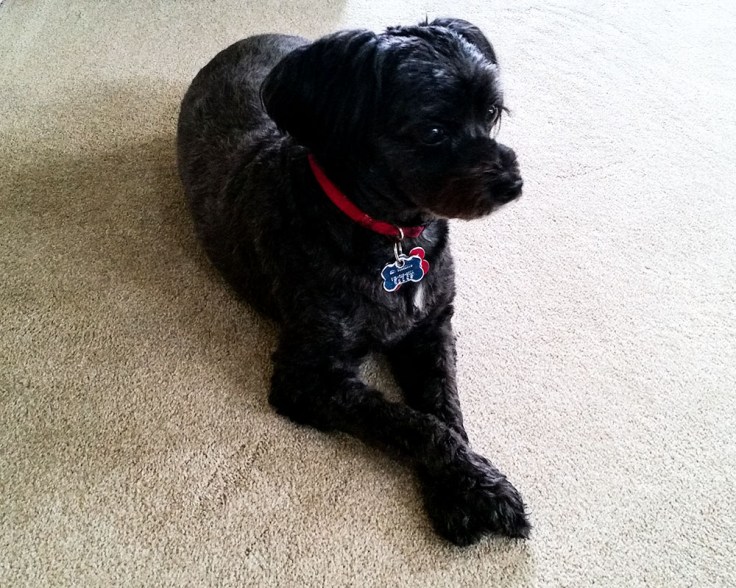
Probably the print values I seem to have the most trouble with are in the darker tonalities, usually the where I need some absolute black and a hint of texture in the shadow values. Even though I was schooled in the zone system a long time ago, the darker values of Zone I, II, III can still be vexing to represent in a final print. My model, Shadow, for today, above, is a good case in point. Per my old Zone System Manual written by Minor White (my revised version was published in 1972), Zone I is an absolute black in the image; where the printer, ink and paper combination can not create anything blacker. Zone II is just about as dark as Zone I, with a hint of texture, while the “shadows” of the print image are usually planned for Zone III, where there is discernible detail in the darker areas of the print image.
One thing that I have learned is when using (Photoshop/Bridge) RAW to initially open a digital photograph the first adjustment I need to work with is the Black slider while watching the image’s histogram. Btw, this is equally true for both a color image and a black & white image. At one time I would let the histogram just barely touch the left border but I quickly realized that did not allow an absolute black, Zone I, to be printed. The resulting image had low contrast, no punch, weak colors. Essentially to create the necessary darker Zone I values I need to bury the left size of the histogram, then start working the Shadow slider to tease out the Zone II and Zone III shadow values.
This was equally vexing for me in the wet darkroom, as the following day after my prints dried, usually what I thought was a Zone I value became a Zone II value in my black and white images. For a while, it just seemed that I could not print a real Zone I black in my prints. Thus I learned to add a little bit more exposure to make an appropriate looking print to compensate for that dry-down change. Today in the light-room with digital printing, its much easier to develop an image with the needed darker values.
Unless you have a low contrast image that you want to convert, such as a foggy day, then the Black Zone I values in your photograph are as critical as the White values. The highlights in my model’s eyes seem a bit more intense and for me pull my eyes to these highlights as a result of the the darker values in the surrounding fur. Not that I am an animal portrait maker, nor do I ever plan to be one, but I think that this does create an effective image of this little guy.
I also find that have darker values will increase the intensity of the colors in an image; which makes sense since that should make the colors become more saturated. When having something that I want to appear bright and colorful in an image, my first tendency is to use a curve layer and raise the values for the ‘bright’ color, which really has a tendency to lighten the color. It just takes a moment to realize my mistake and start reducing the value to increase the color’s intensity. Thus when doing portfolio reviews I quickly notice when a photographer does not set their darker values and their images appears a bit ‘washed-out’ and low contrast. The usual response a few days afterward is a confirmation by the photographer that making this small change in their image values creates a huge visual difference. Cool!
As to Shadow, he is our current guest since his ‘mom’, Debbie, is bouncing between a few hospitals in the Northwest and taking care of Shadow on her medical assignment would not be convent. Shadow and I get along fine, although he has his own particular way to tell me to hurry-up and finish my morning coffee before we talk our first walk of the day. He apparently does not want to complete his morning constitution in the back yard, but provide me with his own unique ‘butt-bomb’ gift during our walks to give me more practice on the proper etiquette of ‘scope-n- bag’. It seems that I am very trainable in that particular regard.
Cheers & stay safe,
Doug
_____
My other exhibitions and workshops:
The Photographers Eye’s gallery exhibition, Living and Photographing in the Time of COVID-19, group virtual exhibition that includes two of my diptychs from the series A Developing Crisis. This online exhibition is from May 8th through August 1st, 2020.
Medium Photo 2020 Workshop: Developing a Creative Book workshop that I will be leading, is now rescheduled for September 24 – 27th, 2020, a four-day extended weekend workshop in San Diego.
____
Featured artwork; Shadow, copyright 2020, Douglas Stockdale

Leave a comment