One of the aspects of alternative photography when using Cyanotypes is the potential for layering on additional colors using a Gum Bichromate contact printing process. This requires multiple digital negatives, getting these negatives into exact registration when printing each color (and if you don’t: Opps!), a lot more chemistry and coating paper in conjunction with watercolors pigment. So my thought as a watercolorist; just jump to the last step and using my watercolor brushes to add the spot color where I want it. Duh.
I have found that the cyanotype printing with my seascapes allows me to predominately use the cyanotype blue for the majority of the print (water and sky) and I only need a little bit of color here and there. So as we say in science, I needed a proof of principle, aka known as continuing the cyanotype artistic learning curve. So having a couple of test prints for my first cyanotype, Surf-Rider I, there is something for me to mess around with…cool!
Doing my background research on Gum printing in conjunction with cyanotypes I find that I really need only to add two more colors (yellow and magenta) to the cyanotype print to create a full color spectrum (CMY), while a black would also be nice to add more emphasis (CMYK) as is done in four-color offset printing. So for this post: evaluating Yellow over Cyanotype Blue.
Lessons learned from reading about gum printing is that they recommend Yellow as the base color, not blue. Probably why the gum printers also recommend using one of the Cadmium Yellows; these are opaque and probably a solid footing for the remainder of the gum printing process. Except when printing over a cyanotype, I think that a transparent watercolor is needed to obtain the combination effect with the underlying cyanotype blue. Yellow + blue = Green.
In my painting kit I have three transparent yellow: New Gamboge, Indian Yellow and Aureolin (and yes, there are others that are available). I also have a Winsor Yellow which is semi-transparent, but I will evaluate that at another time while evaluation the three transparent yellows. New Gamboge leans towards a warm (reddish) yellow, as does the Indian yellow, while the Aureolin is more of an intense golden yellow that leans into green. As you might suspect, each of these layered over a cyanotype will create different effects, in part depending on the intensity of the underlying blue as well as how much one thins with water the watercolor. Okay, I am not going to try to pack 15+ years of watercolor study into this and future posts, so I will provide just the highlights. Such as pre-wetting the watercolor paper (aka wet-in-wet) or printing it dry (aka ‘wet-onto dry’), which I used wet-onto dry for this evaluation in an attempt for a bit more paint control.
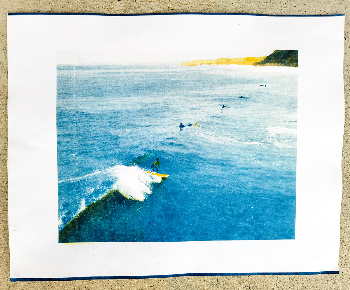
For this painting over the cyanotype, I had noticed and enjoyed the greenish water effect under the breaking wave, which I suspected could add more dimensionality the resulting painted cyanotype (what am I going to call these results; not a painting and it’s not a cyanotype….?) Looking at my evaluation below, I decided on a thinned down layer of Aureolin for this part of the water. Same for the distant bluffs overlooking the Pacific. For the closer bluffs in the distance, I also added a thin layer of Indian yellow over the dried Aureolin.
For the young surfer, I painted part of his surfboard with the brighter Indian Yellow as well as his wet-suit, anticipating that I would be adding some Magenta to his surf-suit next.
Two things: first, a little bit messy and there is a drop of Indian Yellow in the water next to the middle surfer, which due to its staining effect, I could not react quickly enough to remove and second I realize that my brush was too large for the detail work (the edge of the breaking wave) that I was attempting to accomplish. Nevertheless, for a proof of concept, this is working out. Now I have three yellows in my cyanotype painting kit.
One big advantage with my method over the gum printing is that I can selectively paint each of the yellow watercolors exactly where I want. This will also result in each painted cyanotype being very unique.
Next: Magenta!
Cheers & make every day an Earth Day
Doug
____
The Flow of Light Brushes the Shadow, an artist book from Singular Images Press, Fall 2022 release, $60.00 (CA sales tax for those residing in the USA) plus shipping expenses. Message me douglas.stockdale.artist@gmail.com or singularimagespress@gmail for shipping details and PayPal invoice.
Note: The Artist Special Edition (book + extra print) is Sold Out.
Book workshop:
UPDATE! (Sold Out): Southeast Center for Photography (SEC4P): Creative PhotoBook workshop, (Sold Out) a virtual event on Zoom; February 25, 26 & March 4 & 5th 2023; from 10am – 1 pm, EST (3 hour session each day, with a week between the weekend sessions to work your book-dummy).
