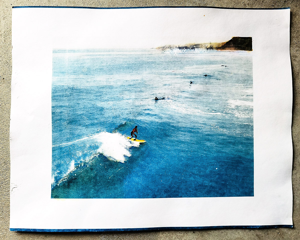
Surf-Rider I (2017), watercolor over Cyanotype, copyright Douglas Stockdale 2022 –
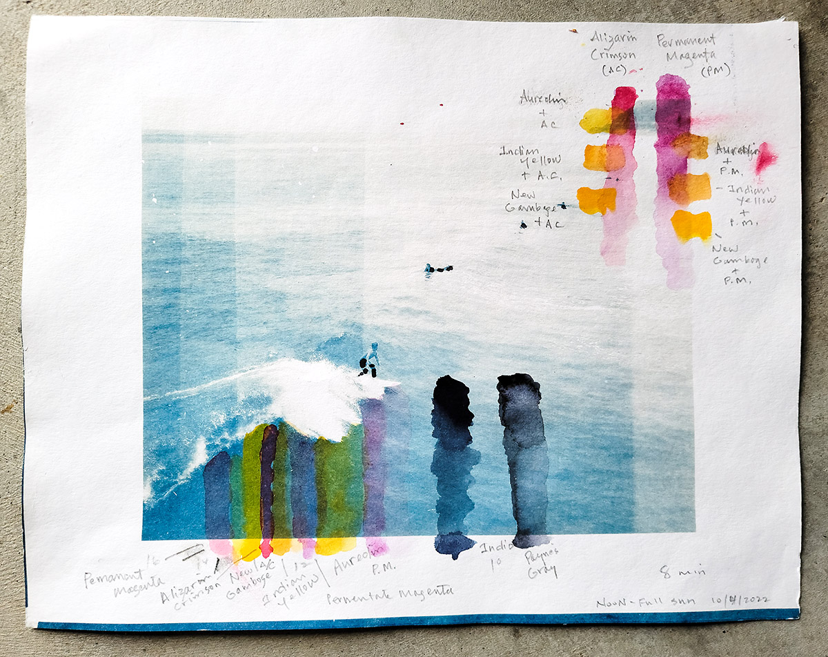
This is now my final version using watercolor paint and watercolor pencils over my Surf-Rider I cyanotype. As I posted previously with the addition of the Magenta and Yellow, the last potential paint color to add will be a ‘black’ to complete the CMYK process. Okay, after looking at the intermediate results, I also realized that a few of my other watercolor bag of tricks are going to be needed if I was every going to be happy with the results. So here’s all that I did:
For the ‘black’ I am opting for two versions of a dark bluish-gray; an intense Indigo and the same pigment formulation but not as intense, Payne’s Gray. My reasoning is that most of the other ‘true’ blacks are also opaque, concealing all of the underlying cyanotype blue, while the Indigo/Payne’s Gray are transparent colors. As the painting folks say; good mixing colors. How that might look over the cyanotype is shown in the color evaluation painting version, below. The thing to note is that when the Payne’s Gray is thinned down with water, the more transparent it becomes, while the Indigo can really become very, very ‘dark’, almost opaque.
For my painting, the surfer wet-suits are indeed black, thus the really intense Indigo was my logical first choice. As in any photograph, getting the blacks really dark can do amazing things for the rest of the image. In this case, not much needed, but I think helped the overall contrast of the resulting painting. For a thinned down Payne’s Gray, that went under the surf board to set the shadow and create a bit more dimensionality. Likewise a few spots under the breaking surf to likewise create a bit more dimensionality to the tumbling ocean water.
In the earlier version when I added the Yellow to the ocean water in front of the breaking surf to try to create that interesting blue-green effect that occurs in the ocean, I also did a horrible job using the wrong size brush and created some very odd yellow highlights on the breaking wave. So this is my first watercolor trick; the yellow is not very staining, so I added clear water to this section of the painting and with a dry paper towel, ‘lifted’ (removed) the troublesome yellow paint. Magic!
I then repeated this watercolor lift technique for the top edge where the distant coastal shoreline protruded out; the yellow and magenta were the wrong combination and I realized that this distant coast was better rendered with the thinned Payne’s Gray. Regretfully this earlier paint combination was a bit stubborn and I ‘bruised’ my watercolor paper during the watercolor paint lift process. You have to be careful with this watercolor rag. One of the many issues using 100 lb watercolor rag versus a more robust 300 lb rag, nevertheless, this 100 lb watercolor rag is great to learn on. And the resulting appearance is a bit more abstract and although not my plan, looks fine to me.
Last, I also did a little bit of work with my watercolor pencils, which in my case is made by the Swiss company Caran D’Ache (Supracolor II). These also have a tendency to become opaque when not thinned down, which works really well to make a few spot corrections; cleaned up the edge of the surfboard top, more emphasis on the young surfers wet suit, and with a white pencil, spotted some more yellow out of the surf edge break. Boom! This looks so much better, which gives me a bit more hope for my future paintings. My only assessment is that the resulting effects look a little bit heavy handed, but for my first attempt at this particular combination, not so bad.
A last note; during this process I added the yellow (Y), Magenta (M) and black (K) progressively over the cyanotype (B), as I might with a Gum Bichromate printed image. As a watercolorist, I will mix the colors I want to use before I paint, as there is not really a need for me or anyone who is painting to add these colors in series. My intent was to figure out what the Gum printing process might look like using my watercolor kit and if I need to purchase any other colors. Which at this point, might be a tube of Phthalo Blue, a ‘sky’ blue similar to cyanotype blue that is transparent that I might use for re-touching or modifying a cyanotype print.
Now to get this painting framed with a white wood square molding, but no glazing (glass) or additional matt, which is the reason that I have left some white watercolor paper to ‘float’ the 8 x 10″ artwork on this 11 x 14″ sheet of 100 lb hot-press watercolor rag. Nice, I am a happy artistic camper!
Cheers & make every day an Earth Day
Doug
____
The Flow of Light Brushes the Shadow, an artist book from Singular Images Press, Fall 2022 release, $60.00 (CA sales tax for those residing in the USA) plus shipping expenses. Message me douglas.stockdale.artist@gmail.com or singularimagespress@gmail for shipping details and PayPal invoice.
Note: The Artist Special Edition (book + extra print) is Sold Out.
Book workshop:
UPDATE! (Sold Out): Southeast Center for Photography (SEC4P): Creative PhotoBook workshop, (Sold Out) a virtual event on Zoom; February 25, 26 & March 4 & 5th 2023; from 10am – 1 pm, EST (3 hour session each day, with a week between the weekend sessions to work your book-dummy).