Morning Shadow, Denverton, California, 2007 copyright Douglas Stockdale
Following up on yesterday’s post with a little more information about how my Roadside Remembrance series is being reconsidered as a Black & White portfolio. This series of roadside memorials was starting to get a little traction in 2008 and I felt it had potential to go beyond the LensWork magazine publication as a photobook. The project at that time had a uniqueness, although I did feel that the subject did not lend itself to a poster (which the National Safety Association proved wrong) or artwork that someone might want to hang in their home. After a couple of rejected book submissions this project began to coast, as I was feeling a little defeated. I stopped making book submissions and I became very introspective about the potential for this series.
As a result, I “jumped the shark“, the t.v. slang for when there is a big change in a series plot, resulting in the audience losing interest and the series quickly tanks. Perhaps visualizing this series in color photographs and renaming the series working title did ‘jump the shark’. Nevertheless, I did learn more about myself during this transition, such as photographing my Ciociaria project in color, which resulted in the publication of this book by Edizioni Punctum (Rome, Italy). In retrospect, I am thinking that one aspect of my Roadside Rememberance series was visually stronger as Black & White photographs, thus a version that I am continuing to consider.
Now I am re-examining all of my original photographs and although I will develop these as Black & White images, I have found that my interpretation has become a bit more refined. Part of which is that I have learned more about how to convert a color digital file using Photoshop to a Black & White version.
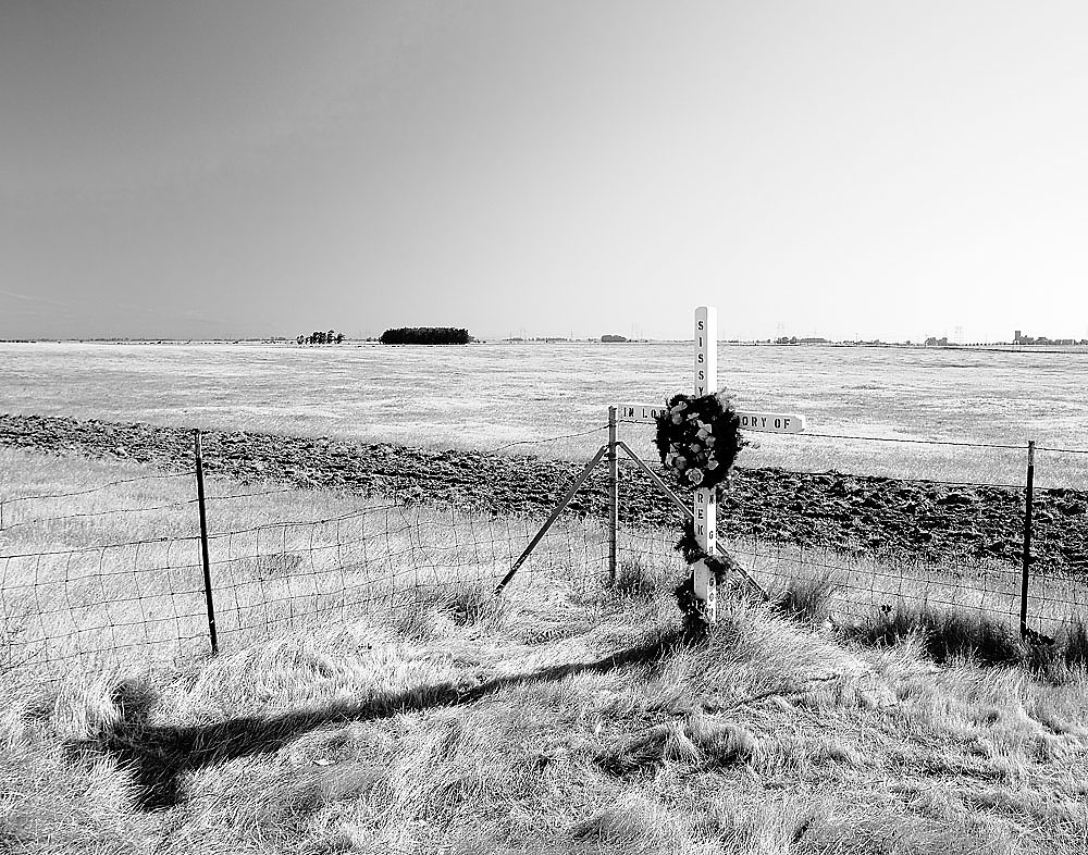
As an example is the photograph, Morning Cross, Central California, above, that I had used a lens polarizer for the original exposure, that regretfully effected only part of the morning sky. This resulted in a dramatic darkening on the left side of the sky and fading to almost white on the right side of the print, which I had found visually distracting. Now with a Photoshop Black & White adjustment layer and playing with the two blue settings, I am able to create a little more even sky tonality across the far horizon. I think the print/image retains more of the emotional impact that I had experienced and I am very happy to have revisited this image.
Btw, I think that the title of this photography is a nice play on a homophone version of morning; ‘mourning’ as it relates to what this remembrance represents, both being applicable.
Cheers,
Doug
