Max Planck’s Magic Glasses (#9995) copyright Douglas Stockdale 2026 –
When I started to experiment with the inkAID pigment ink transfer process, my interest was in transferring high contrast black and white images onto rag paper that I had previously printed with intaglio inks. Wow. I had not realized all of the potential ins and outs with this interesting process.
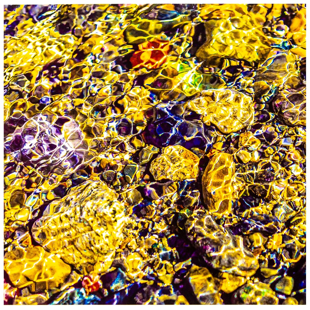
Initially I was getting some lower contrast black and white pigment transfer prints which were a bit different than I had anticipated. I had attributed the contrast differences due to my lack of experience with this finicky process. In reading other posts and articles about the inkAID transfer process, I did not recall any mention of how the printing on the inkAID transfer film might impact the resulting transfer print’s contrast range. Then I started to experiment with color pigment ink transfers and I quickly realized the inkAID transfer film has not only a different contrast range, but also a different color profile. The first image below is an image of a straight color ink pigment transfer with really muted colors and very low and muddy contrast.
My initial thoughts were that I just needed to develop a new PhotoShop (compensating) adjustment curve, similar to what I had developed for my cyanotype negatives. As anticipated I needed to make a series of prints with various adjustment curve tweaks, saving the adjustment curve file for an eventual fix for each file that I was going to print an inkAID transfer film image. For the cyanotype adjustment curves I had to compensate for which OHP film I was using and what medium I was printing on. I anticipated I would only need one contrast adjustment (compensating) curve for the inkAID transfer film regardless of the paper I was printing on.
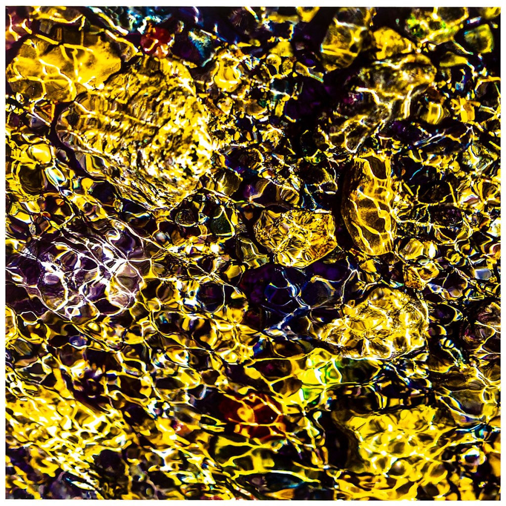
On my third test print (bottom image) during this adjustment curve development, I think I had the contrast adjustment curve I wanted. I now realized that I was having issues getting the anticipated colors, especially the reds and oranges, that were on my monitor onto my transfer prints. Crap. My “easy fix” was going to require a bit more work; I needed to create a new color print profile for the inkAID transfer film for my Canon printer.
To create print color profiles I use an X-rite i1 Studio system. This process was going to be prolonged as I had to successfully transfer print the color swatches as I moved through this process. Again, because the inkAID transfer process can be difficult, I had to reprint the fist color swatch three times, then cut and paste the best set of images to be able to proceed to the second state of the i1 Studio print profile process. Then another two set of transfer prints of the second color swatch to paste together something that my i1 Studio scanner would recognize.
Done!
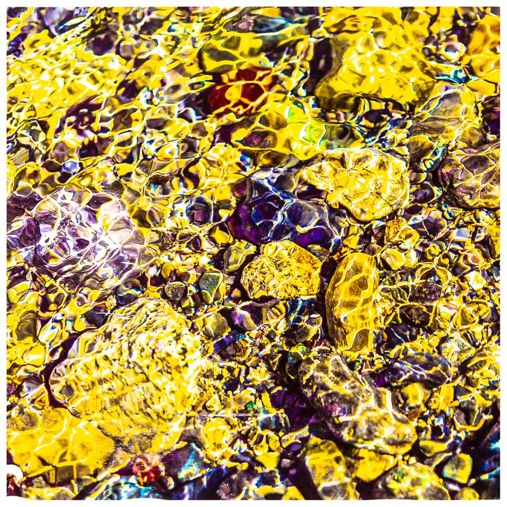
For the print above, this was a combination of adding the new contrast adjustment curve to my image file in PhotoShop, then selecting the new inkAID transfer film color profile for my Canon printer. Bingo! A resulting pigment ink transfer print that looked like what I had on my monitor. As Ansel Adams might say; It’s always nice to have a print that is just as you have previsualized.
Hopefully, I have discovered all of the basic ins and outs of the inkAID pigment transfer process, while my transfer print success rate is improving, I am still having ink transfer issues. At least now I have the image contrast and colors that I had anticipated.
Best regards,
Doug
___
___


Leave a Reply