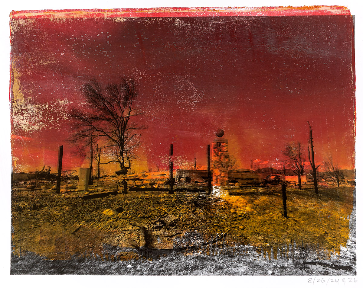
Urban Ashes (Superior, Colorado, Marshall Fire, 2022, no. 92550) Copyright 2026 Douglas Stockdale –
Once I started to experiment with the pigment ink transfer process with inkAID film and transfer solutions, I began to anticipate how I might use this transfer printing process with my earlier alternative photographic artwork, such as my cyanotypes and initial Urban Ashes monotypes.
I have a habit of saving my artwork ‘failures’ as I never can anticipate how I might be able to salvage these at some point in the future. (okay, maybe I am a bit of a pack-rat, while on occasion it does pay off!). This morning I think I was able to save one of my earliest attempts with the gel-plate relief printing process with a pigment ink transfer (above), something that I started experimenting with two years ago, almost to the month.
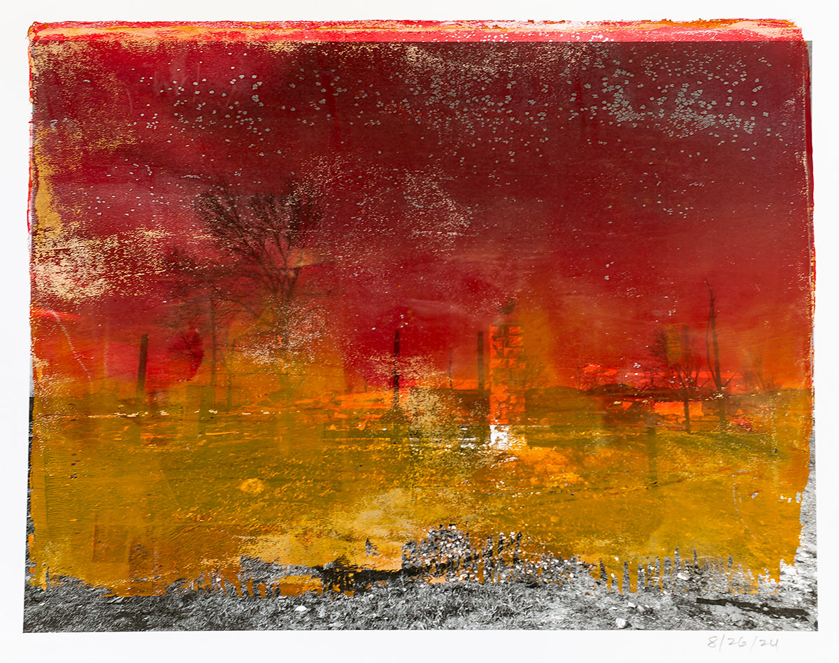
My very first gel-plate monotypes started in 2024 with the idea of combining laser prints with acrylic transparent paint, and the print below is from what has become my Urban Ashes project, was my first attempt. Wow, way too many things were wrong for this print for me, especially with a huge loss in the details of the urban chaos resulting from the Marshall Fire. So maybe two acrylic paint transfers was a bit too much and I repeated with a single acrylic paint transfer. All that did was confirm that I really needed to make some technical adjustments. That’s when a friend suggested using transparent intaglio inks instead of acrylic paint, which was the help I needed.
Nevertheless, I kept those initial two monotype prints and over the past weekend, I realized that layering a pigment ink transfer of a high contrast black and white image over this earlier monotype might work. Once I prepped and printed the transfer film with the image, then laid the film on top of the monotype, I was able to pre visualize the final results. All systems were GO for launch this morning to complete my pigment ink transfer.
The pigment ink transfer went pretty smoothly (not perfect, but close) and the print that resulted was what I had previsualized. All of the underlying colors that symbolized the chaos of an urban wild fire were present, while the urban landscape details now had a stronger visual impact. Win-win.
Now thinking about what’s next up for using the pigment ink transfer process. fun, fun, fun.
Best regards,
Doug


Leave a Reply